
How to Add Stories to Mobile Apps
Discover the easiest way to add stories to a mobile app. Use one SDK and a visual console to publish content, run campaigns, and engage users instantly.
Karina
Author @ InAppStory
In-app messages appear when the moment is right. They can welcome new users, explain a feature, or push someone to complete checkout. Unlike email or push, they live inside the product and speak while the user is still listening. This guide walks you through how they work and how to set them up.
An in-app message is a piece of content displayed within the app interface itself. Common formats include:
Unlike push notifications or email, these messages are delivered only when the user is already active in the app. Their purpose is to provide contextual information, guide behavior, or highlight functions without redirecting the user outside the product environment.
In practice, they are applied to solve specific product and marketing challenges:
The effectiveness of in-app messages depends on timing and context. A message linked to a clear trigger such as app launch, reaching the checkout page, or clicking a product category will integrate smoothly into the user journey. Random or excessive messages increase friction and reduce trust.
In-app messages require one technical component before they can be created: the SDK. An SDK, or software development kit, is a block of code that connects your app to a third-party service.
Once installed, it enables the app to display formats such as stories, mini-games, or in-app messages. Integration is a one-time process. After this step, your marketing and product teams can design and publish messages directly through the console. The example below is based on how these steps are implemented inside the InAppStory platform.
Step 1. Choose the format
In-app messaging platforms usually offer three formats:
1. Pop-ups (modals): small windows that open on top of the interface. They work well for time-sensitive information such as discounts or confirmations.
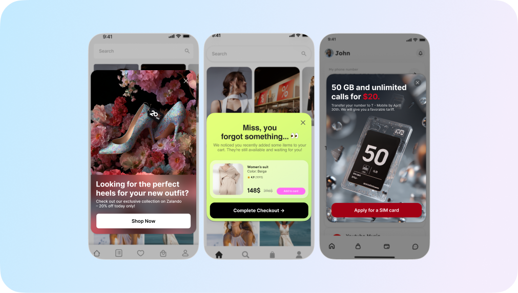
2. Bottom sheets: sliding panels from the bottom of the screen. They deliver content without fully interrupting the user’s current flow.
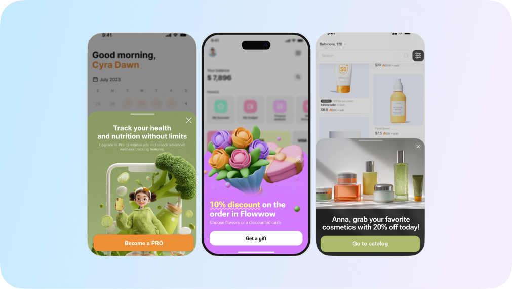
3. Fullscreens: panels that take over the entire screen. They are suitable for onboarding steps, tutorials, or campaigns that need maximum visibility.
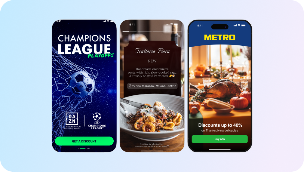
Each format can be reused, cloned, or edited in the console. Format selection depends on the business goal: onboarding calls for fullscreen guidance, while a promo code may be better suited to a pop-up.
Step 2. Add the content
Once the format is chosen, the editor allows you to insert content blocks:
Backgrounds can be customized in several ways: using predefined colors, a color picker, or a full image upload. Important interface elements should not be embedded into the background image, as resizing may crop them on different devices.
Step 3. Set display rules
Rules define how often and under what conditions the message appears:
For example, a message with priority “10” will be shown before one with priority “9,” even if both share the same trigger. If limits conflict (e.g., hourly vs daily), the stricter one applies.
Step 4. Configure additional fields
Advanced settings let you pass custom data:
These options help align messages with analytics systems and CRM workflows, ensuring consistency between marketing and product data.
Step 5. Preview and publish
Before publishing, each message can be previewed on a real device. Scanning a QR code in the console loads the draft into a test app for validation. After adjustments, the message can be published according to the defined rules. Once live, its performance (opens, clicks, and CTR) is tracked in the analytics console.
Value comes from how precisely messages are integrated into the app journey. They should feel like part of the product, not a layer on top of it. Below are principles and features that advanced teams use to make in-app messaging both effective and unobtrusive.
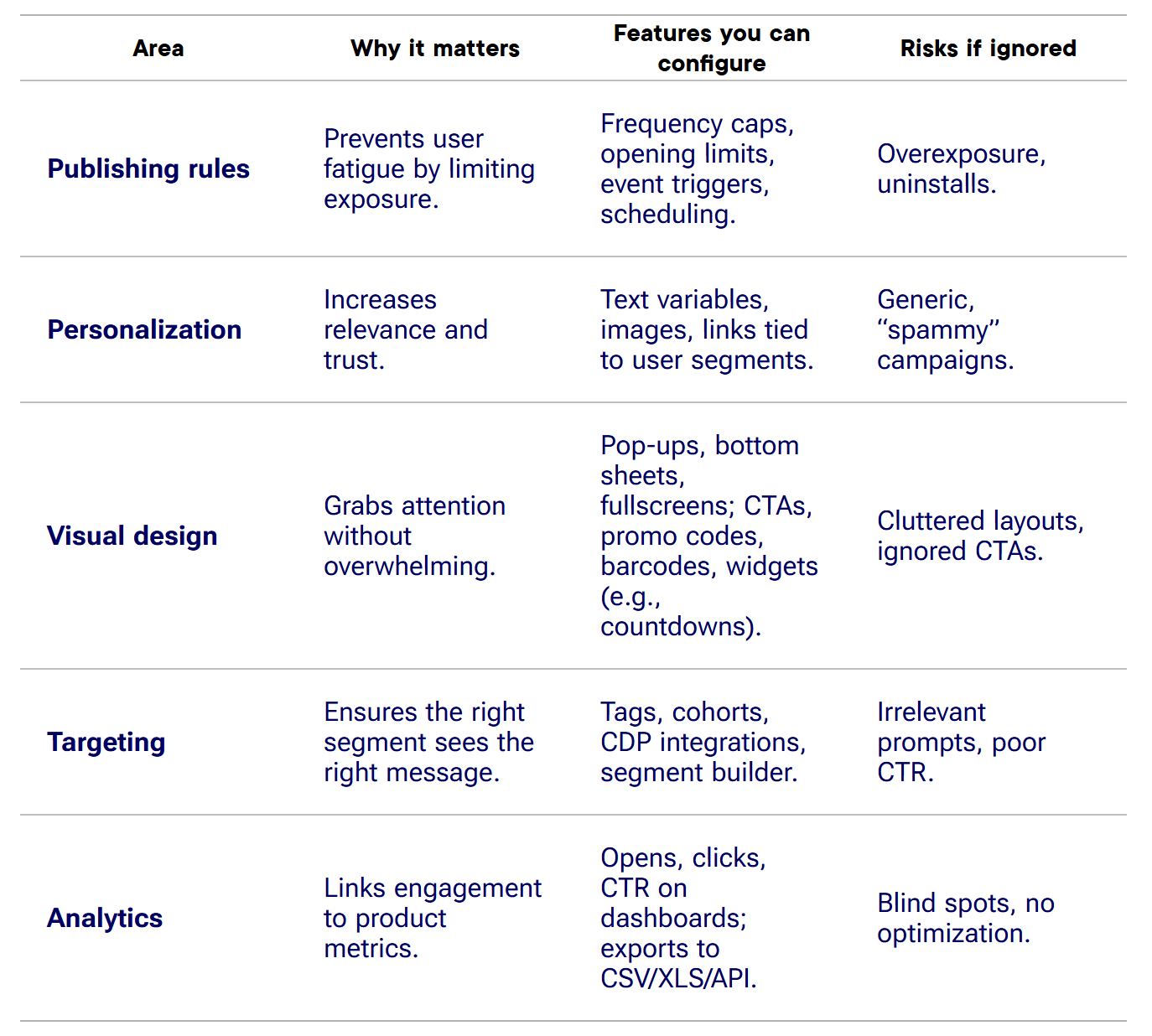
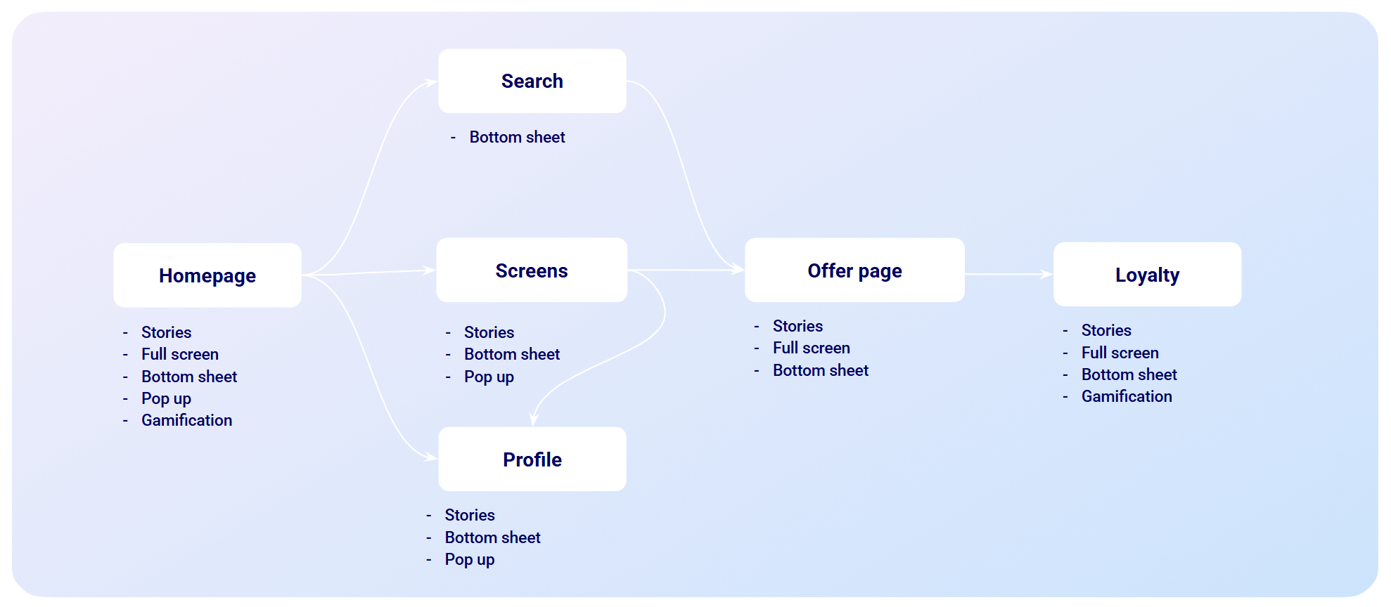
Mapping formats to specific stages ensures each message serves a clear role. For example, a discount shown as a bottom sheet during checkout feels supportive, while the same message as a fullscreen on the homepage may feel intrusive.
Looking at the flow of a user journey, it’s clear that no single in-app message type works everywhere. A fullscreen that feels helpful on day one becomes annoying on day thirty. A bottom sheet that nudges checkout works only if shown once, not ten times. The power of in-app messaging lies in making these trade-offs consciously, with data guiding each decision.
What follows from this is simple: in-app messages are not just a feature to enable but a practice to maintain. The most effective teams treat them as part of the product experience, not as a campaign channel to be switched on and off. They test, cap, personalize, and measure, and they know that the user’s trust is the ultimate metric.

Read also