.jpg?2025-09-18T15:27:22.534Z)

.jpg?2025-09-18T15:28:26.750Z)
How HomeExchange Turned User Stats into Stories
Karina
Author @ InAppStory
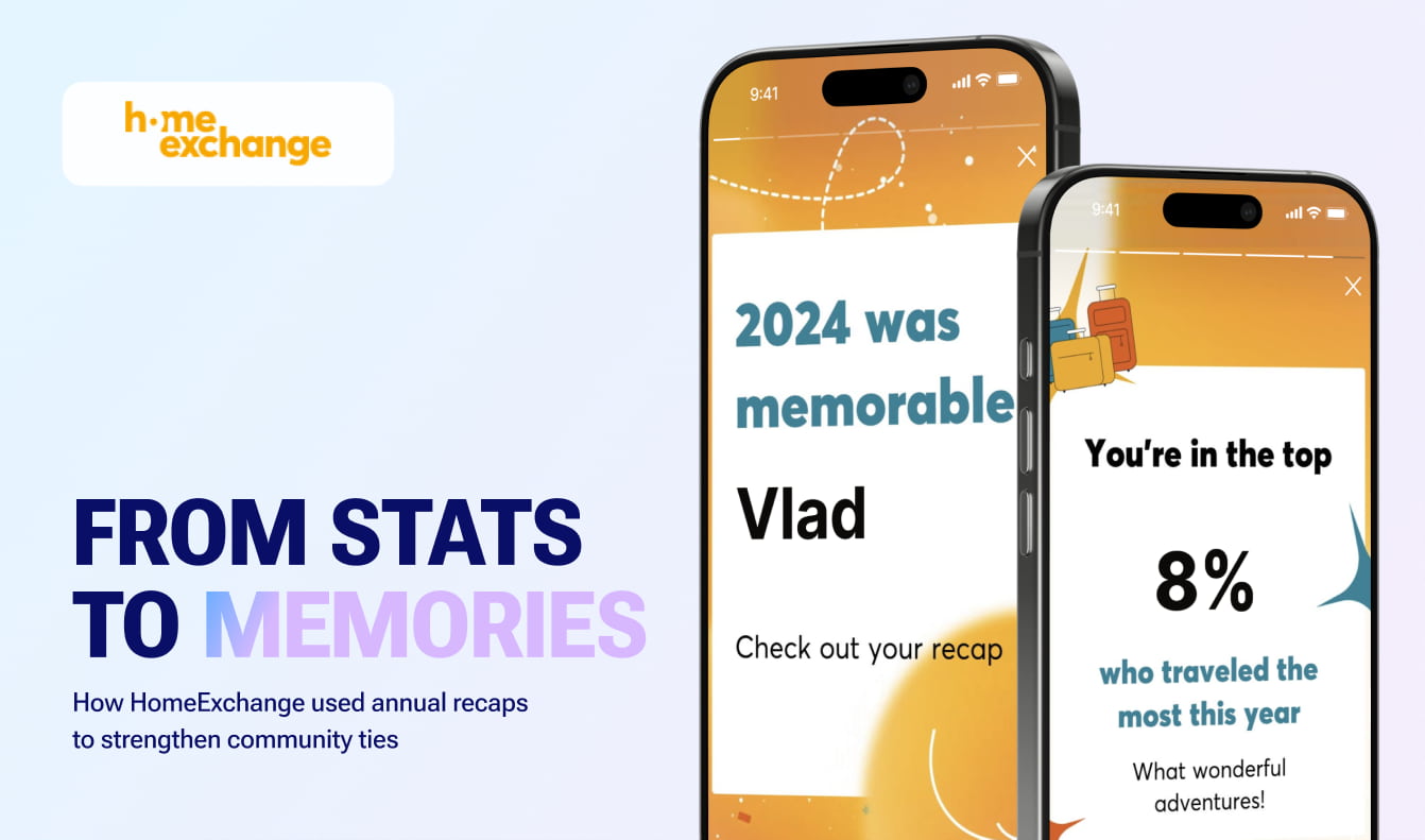
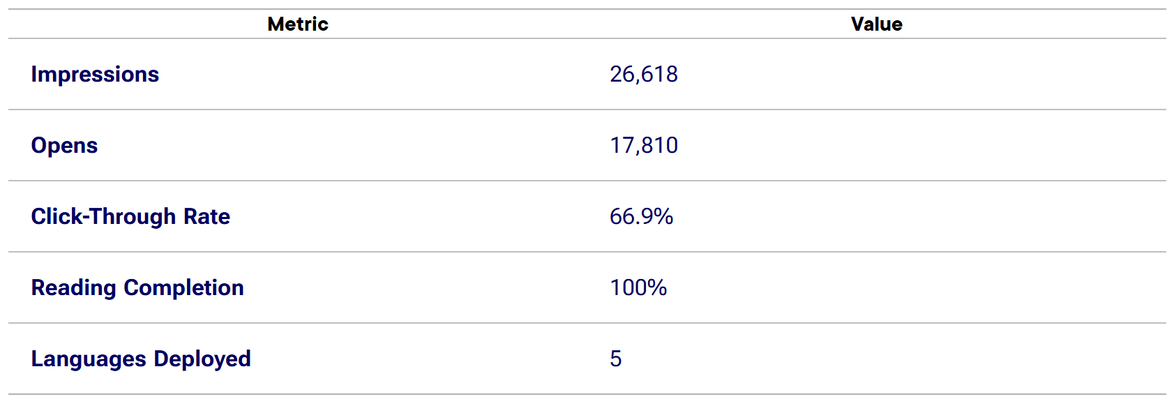
HomeExchange launched a so-called “Year in Review” campaign using in-app stories to create personalized recaps for both hosts and travelers. Built in a Spotify Wrapped style, the stories featured exchange data, location highlights, top traveler stats, and shareable messages across five languages. The campaign reached 26,000+ users, achieved a 66.9% open rate, and saw 100% story completion proving that personal storytelling builds stronger user connection and brand visibility.
Why Did HomeExchange Launch a Year-in-Review Story?
As a peer-to-peer home exchange platform, HomeExchange facilitates meaningful, affordable travel around the world. By the end of 2024, the team wanted to celebrate its community’s experiences not with a generic campaign, but through personalized storytelling.
The challenge: create a digital moment that speaks to both travelers and homeowners, encourages sharing, and reinforces platform loyalty all without external media buys.
What Was the Campaign Concept?
The campaign took inspiration from popular “recap” formats like Spotify Wrapped. Each user saw a personalized story that visualized their 2024 experience:
- For travelers: number of exchanges, cities visited, nights stayed, and their rank in the top % of active users
- For hosts: how many times their home was added to favorites, how many requests they received, and fun encouragements (“What a result!”)
.webp?2025-10-06T12:11:33.743Z)
The stories were light, festive, emotionally driven and local. The team launched the experience in five languages: English, French, Italian, Spanish, and Portuguese.
How Did They Build It?
HomeExchange used InAppStory to create mobile-native interactive stories that pulled from user-level data. The visual format made every story:
- Scrollable, swipeable, and self-contained
- Ready to share with one click
- Fully personalized based on the user’s actual activity
.webp?2025-10-06T12:17:47.938Z)
Each screen highlighted a different stat, followed by a call-to-action to “Share your story.” The campaign’s modular structure made it scalable across markets and user types.
What Results Did the Campaign Deliver?
The performance exceeded all benchmarks for mobile story content:

Every person who opened the story completed it, thanks to lightweight copy, visual design, and personal relevance.
.webp?2025-10-06T12:24:47.003Z)
What Made It Work?
Many end-of-year campaigns focus on volume. This one focused on context: travelers saw movement, while hosts saw impact. The design honored both sides of the community without forcing a one-size-fits-all message.
- Data-driven personalization: Every screen reflected something real about the user’s year
- Emotional design: Confetti, warm colors, travel illustrations — all evoked memory and pride
- Built-in shareability: The “Share your story” CTA was embedded across the experience
- No-code speed: The campaign launched in time for year-end, with no dev delay
- Localized reach: Stories felt native to users across five different languages and cultures
What You Can Learn from This Case
This campaign shows that retention can start with reflection. You don’t need a new product or feature to drive engagement. Sometimes, showing users what they already did is enough. If the moment feels timely and the message feels earned, users stay.
- Use annual recaps to emotionally reconnect with users and increase loyalty
- Build “Wrapped-style” mobile stories to celebrate both product use and user identity
- Design for all core audiences, in this case, travelers and homeowners
- Make stories modular and localizable to scale across languages
- Use real platform data to drive engagement without a discount
Want this in your app?
InAppStory helps teams launch in-app messages, stories, banners, and gamified flows that drive feature adoption, LTV, and conversion — all from one dashboard.


Read also
.jpg?2025-09-18T15:26:48.030Z)

.jpg?2025-09-26T13:50:32.013Z)

.jpg?2025-09-26T14:07:30.949Z)
.jpg?2025-09-26T10:13:01.216Z)